Beyond the basics — such as displaying your CTAs clearly — here are the main principles we follow when it comes to building websites.
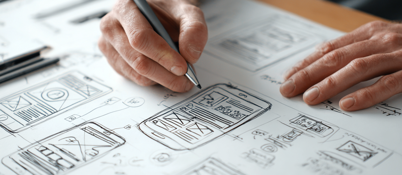
The visual is the first impression and needs to be top notch. That's why we design everything ourselves in Figma. We want your website visitors to relax — we want to build immediate trust. There are many ways to fail when it comes to web design, but if you follow some basic rules, there are ways to make it work. Having a visual hierarchy, sticking to a few color elements, as well as design elements, and deciding on a clear eye path are some of the fundamentals that we live by.
Consistency is a key tenant of our websites. We make sure to build a graphic profile with consistent shapes, colors & graphical elements.
The design elements on your website should be predictable. We don't want to surprise the visitor. On our websites we quickly introduce the design elements — colors, border radius and buttons — then implement them consistently across the website.
The key is that whatever page your customer visits, they get the reassuring feeling a well-designed, consistent website gives.
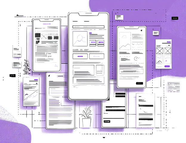
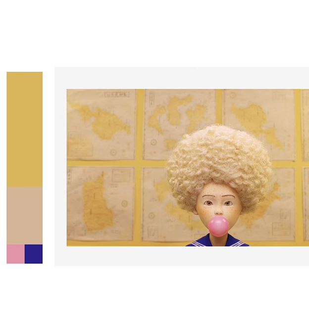
This simple rule makes every website feel more coherent, easier to navigate and professional.
I bet you've never heard of the 60/30/10 rule, but trust me — once you see it, you cannot unsee it. It's absolutely everywhere, from movies to fashion to interior design, and of course in professional web design.
This is the rule we abide by when we develop your website. Sometimes we mix it up — say 60/30/5/5, or even 60/30/3/3/3 — but it's still the same hierarchy.
Great website design includes tasteful transitions & interactivity that's so pleasant to use it actually releases dopamine.
Scroll effects, hover effects & transitions are grossly misused by web designers. The effects should be smooth and hardly noticeable, but they should be there. Tastefully applied, they release dopamine — but overdo it and it creates friction. If visitors have to wait three seconds for each section to load because of a fancy transition, you're just annoying them.
Smooth effects and interactivity, tastefully applied, lead to pleasant emotions — people want to stay on the website.

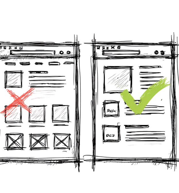
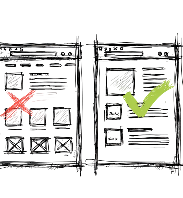
Fonts, design elements & layout should use an easy-to-follow eye path that guides the visitor's eye vertically down your page.
Sometimes you visit a website where the colors, elements and design are just all over the place. Just as we use color sparingly — we use design elements carefully to guide the eye vertically, not horizontally, down the page.
This reduces friction — that psychological feeling of a high work load. The more cluttered a page is, and the harder it is to find a clear eye path, the more you tax the visitor's brain, and they will subconsciously start looking for the dreaded back button.
After 10+ years in the digital marketing space, we've learned that most people simply don't take the time to read your copy. Hence, we make sure our websites are skimmable.
Since people are in a rush, we rarely add more than four rows of text at a time. That also reduces friction and the sense of work load to engage with your website. We always avoid text walls, breaking up the text with headlines, bullet points and bold text.
This is part of our philosophy of adding shortcuts. Through carefully selected elements — headlines, bullet points and design elements — people should quickly be able to tease out your value proposition, and determine that you're a reliable option who can get the job done.
While AI websites are all the rage nowadays, we make sure to build websites that feel human. Part of that is designing every website ourselves in Figma. Another part is using real photos.
This is particularly important when it comes to images. We're getting wise to AI images — an AI image doesn't transmit value, it's value-neutral or even negative. Remember, a website is not a placeholder, it's there to transmit value. So we typically insist that you provide us real photos. Usually we're one step ahead, and have already gathered your photos from the internet before you even sent them!

We keep it light. We know that people simply don't take the time to read your copy. So we focus on headlines, bullet points, and avoid text-walls like the plague.
We use a visual hierarchy. When everything has the same size, nothing stands out, and we tend to ignore it. Just stuffing identical boxes next to each other — with nothing standing out by color, shape, movement or size — makes us tune it out. Solution: emphasise the important copy and use a hierarchy of font sizes.
We add soul to the website. People want to do business with people, not with AI. We do everything we can to get a hold of real images of you and your company.
We make sure there's an eye path. Great website design flows vertically, not horizontally. Identical elements placed next to each other add a lot of friction for the visitor. It should be easy to go from one item to the next.
Smooth transitions release dopamine. We aim to give your visitor small dopamine hits as they browse your website. Smooth transitions, carefully selected animations and scroll effects signal that you know what you're doing, build trust, and make your website a pleasure to interact with.
We'd like to be friends. To instantly help you boost your rankings we offer a free audit of your Google Business Profile. Wanna see if we are a good fit? Send us a message — as a gift we'll audit your online presence for free, no strings attached.
Your free Google Business Profile audit is on its way. Keep an eye on your inbox.
How we use words to instantly build trust and win customers online, in the age of AI slop.
Read more → Blog — Business InsightWhat it is, and why you need one — with the story of how Lucky Strike won by simply saying "it's toasted."
Read more → Back to Velocity.WebSmart services that turn visitors into customers — websites, lead capture and review automation.
View services →